Other side of imagination
2025/Brand identity
Client
Artpink AcademyRole
Graphic Designer
CHALLENGE
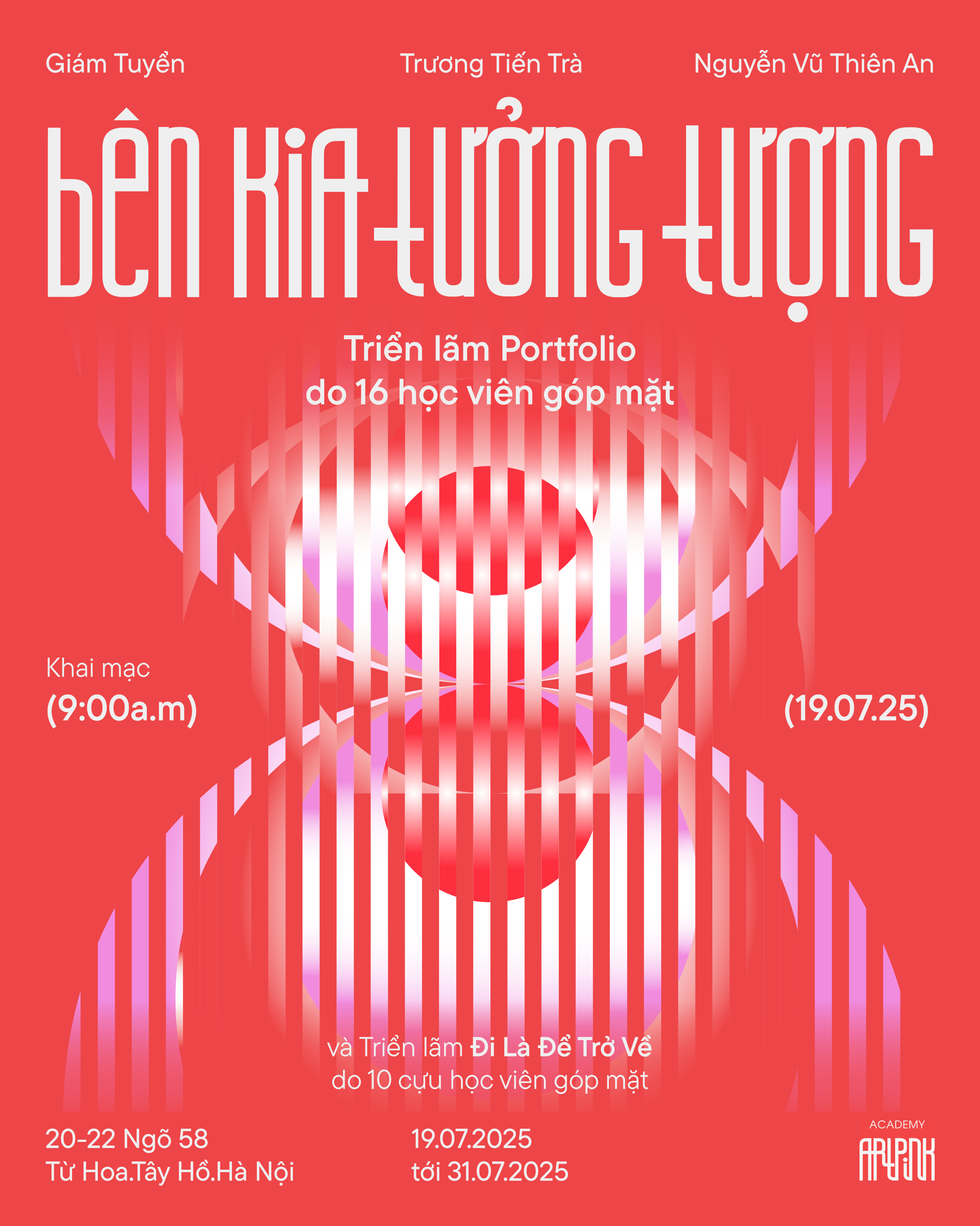
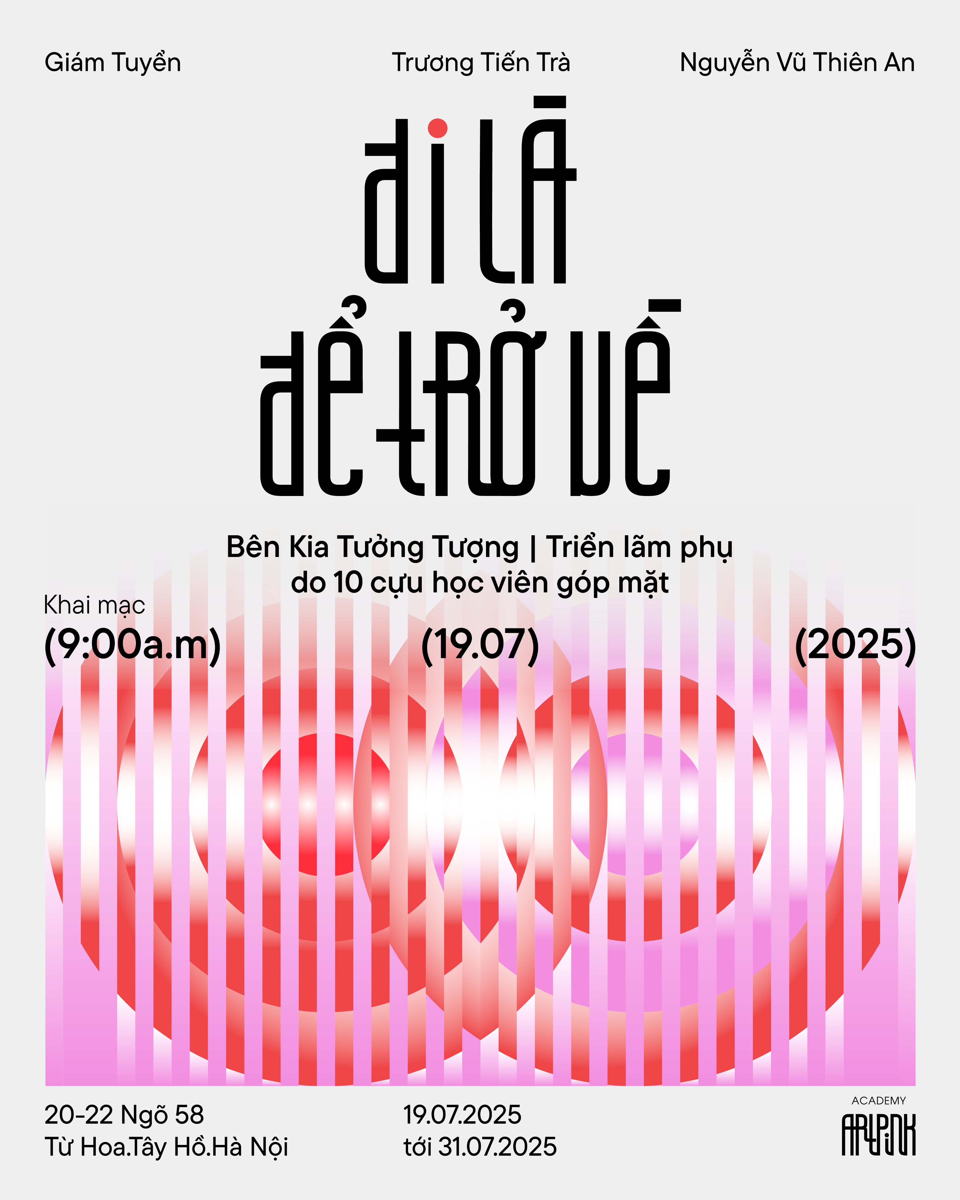
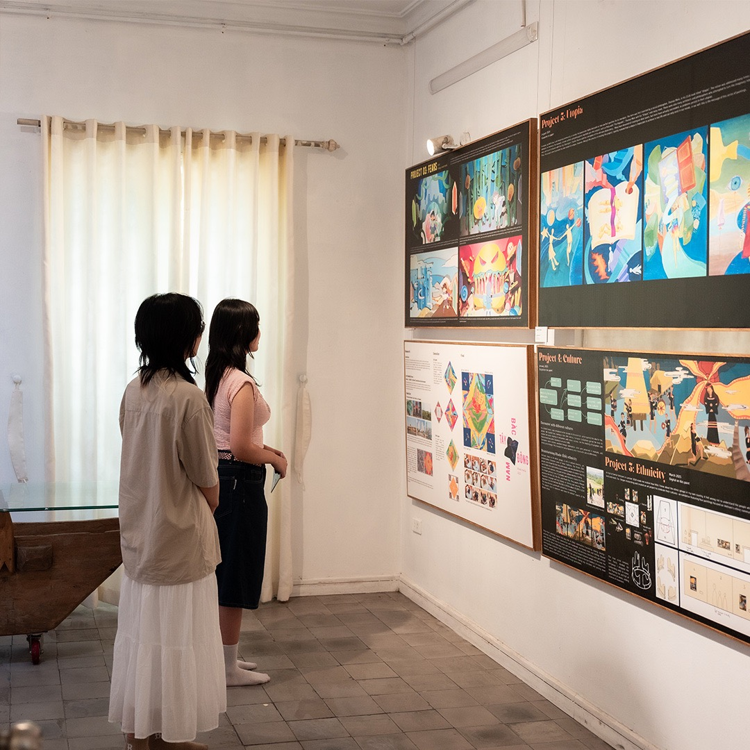
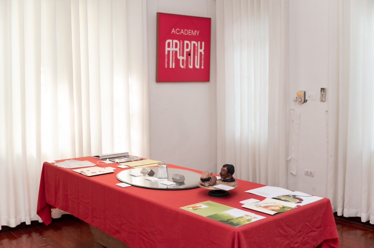
In 2025 the art academy Artpink presented two exhibitions called “Other side of imagination “ and “To go is to return”, showcasing works from current students and alumni. After 6 years of operation, their students’ artworks have evolved from traditional art forms to experimental and contemporary design, which required a fresh visual exhibition identity that can capture the academy legacy of elite art education while bringing young, forward-looking energy.
DESIGN SOLUTION
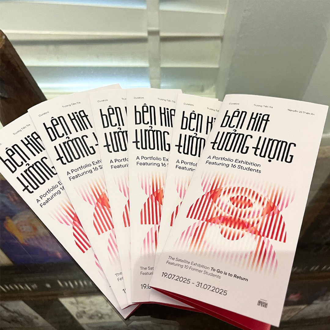
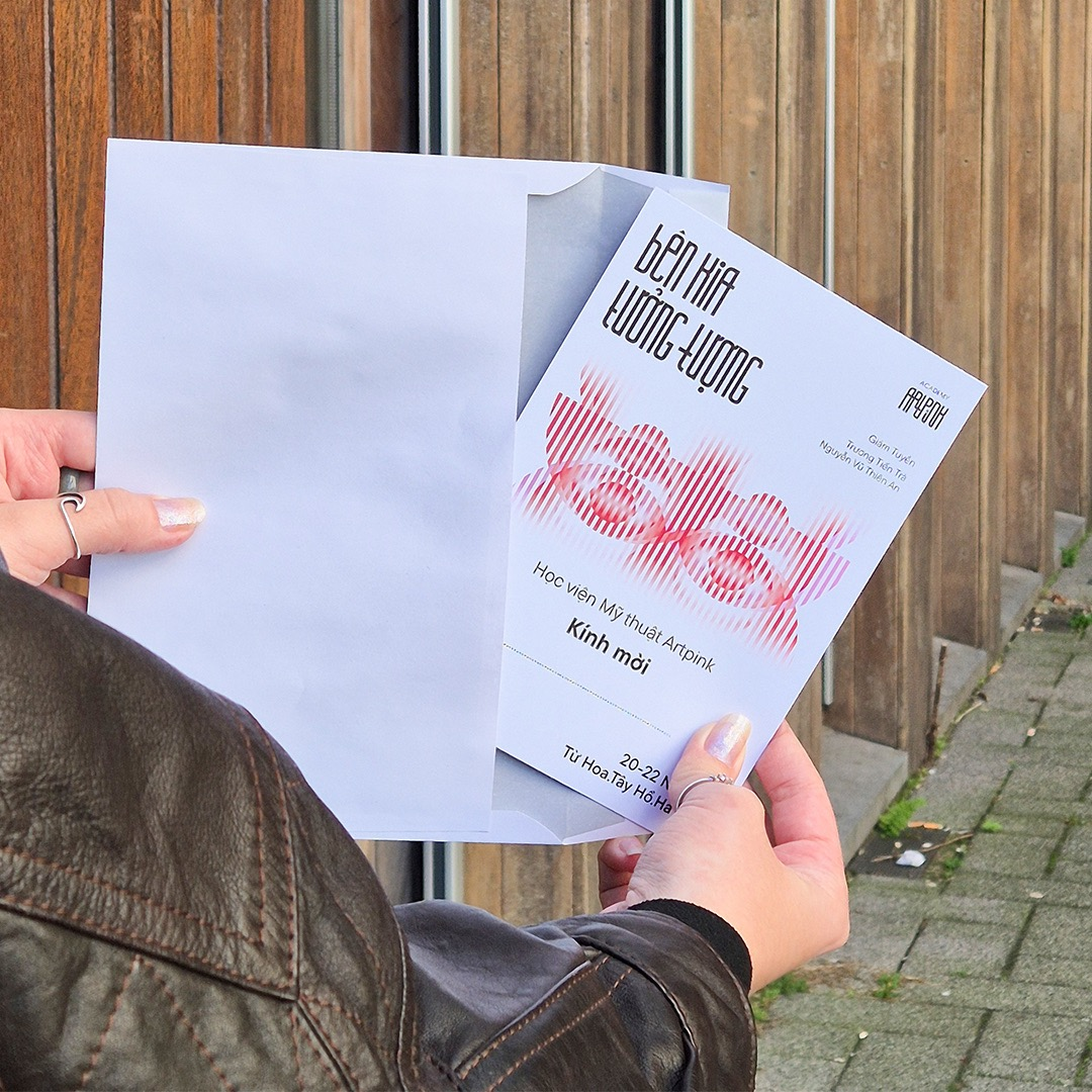
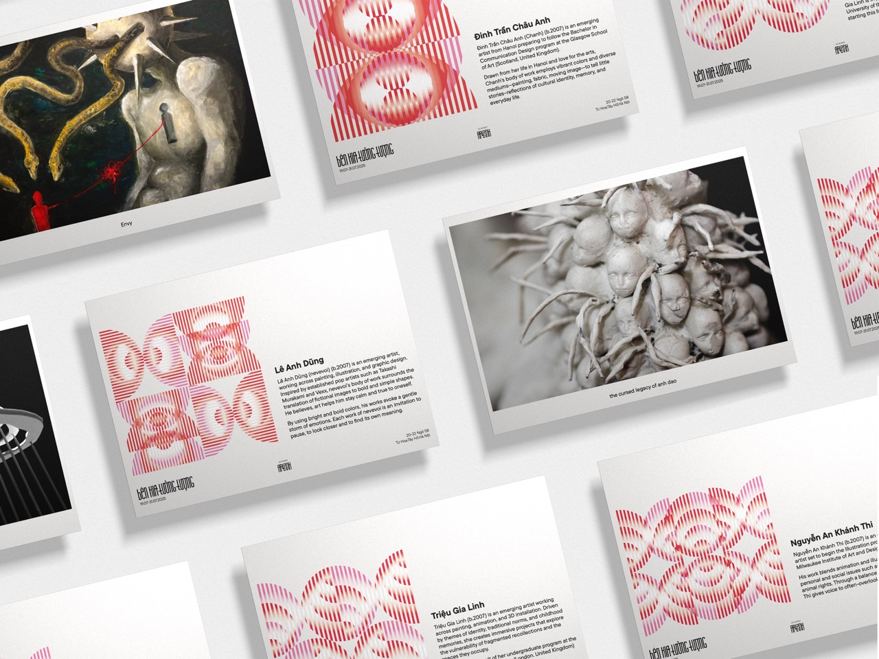
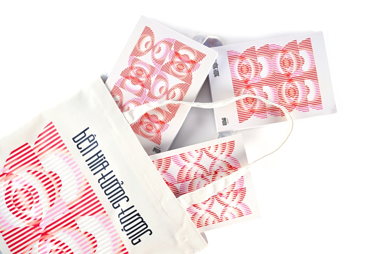
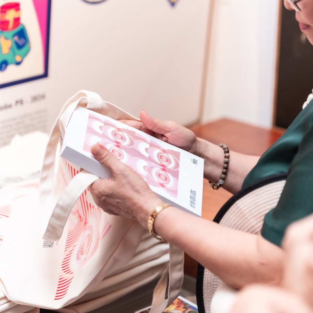
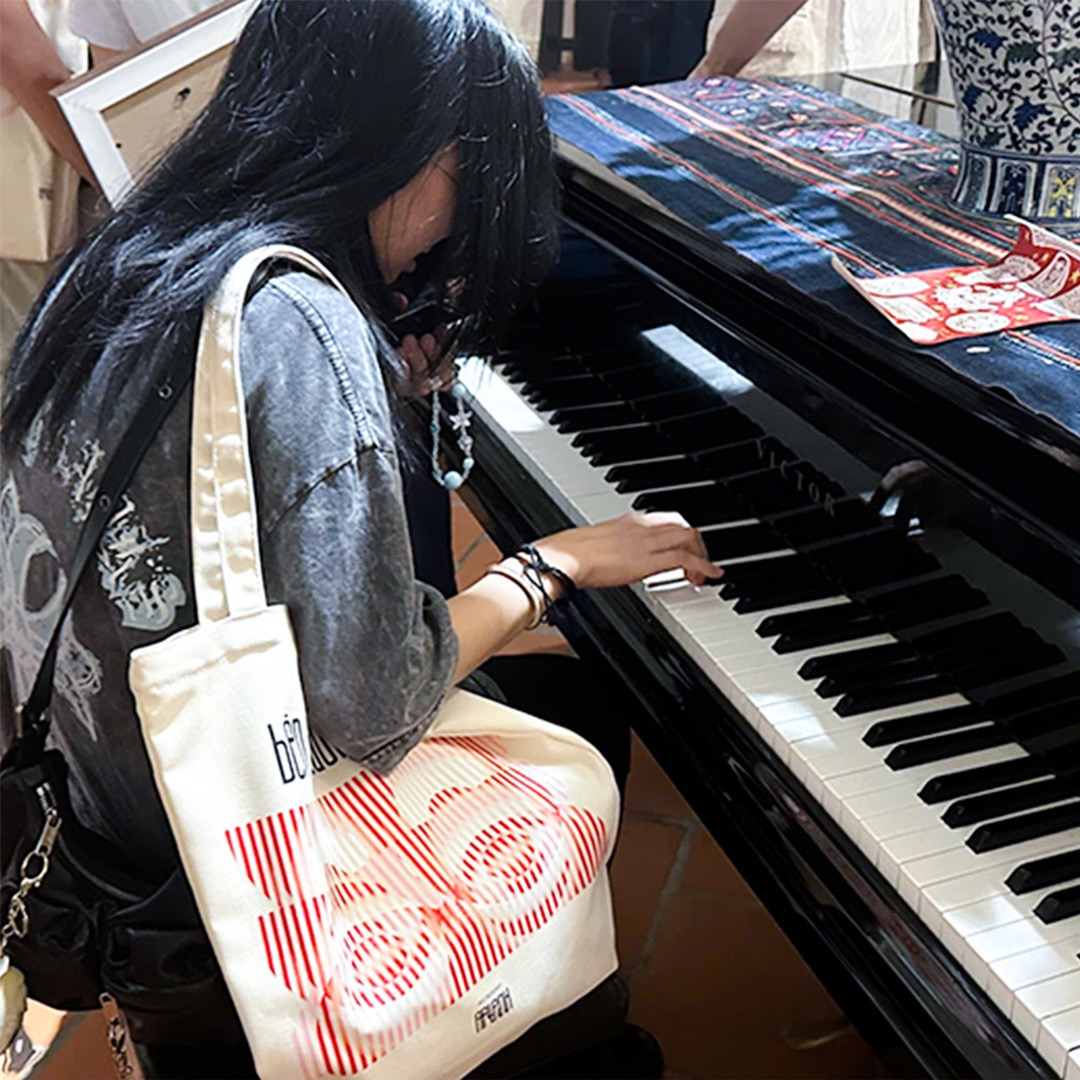
To convey the core messages of the exhibition, the design uses geometric circles motif to symbolize the circulation of clouds and water, where evaporation and rainfall represent the continuous cycle of learning abroad and returning home to contribute.
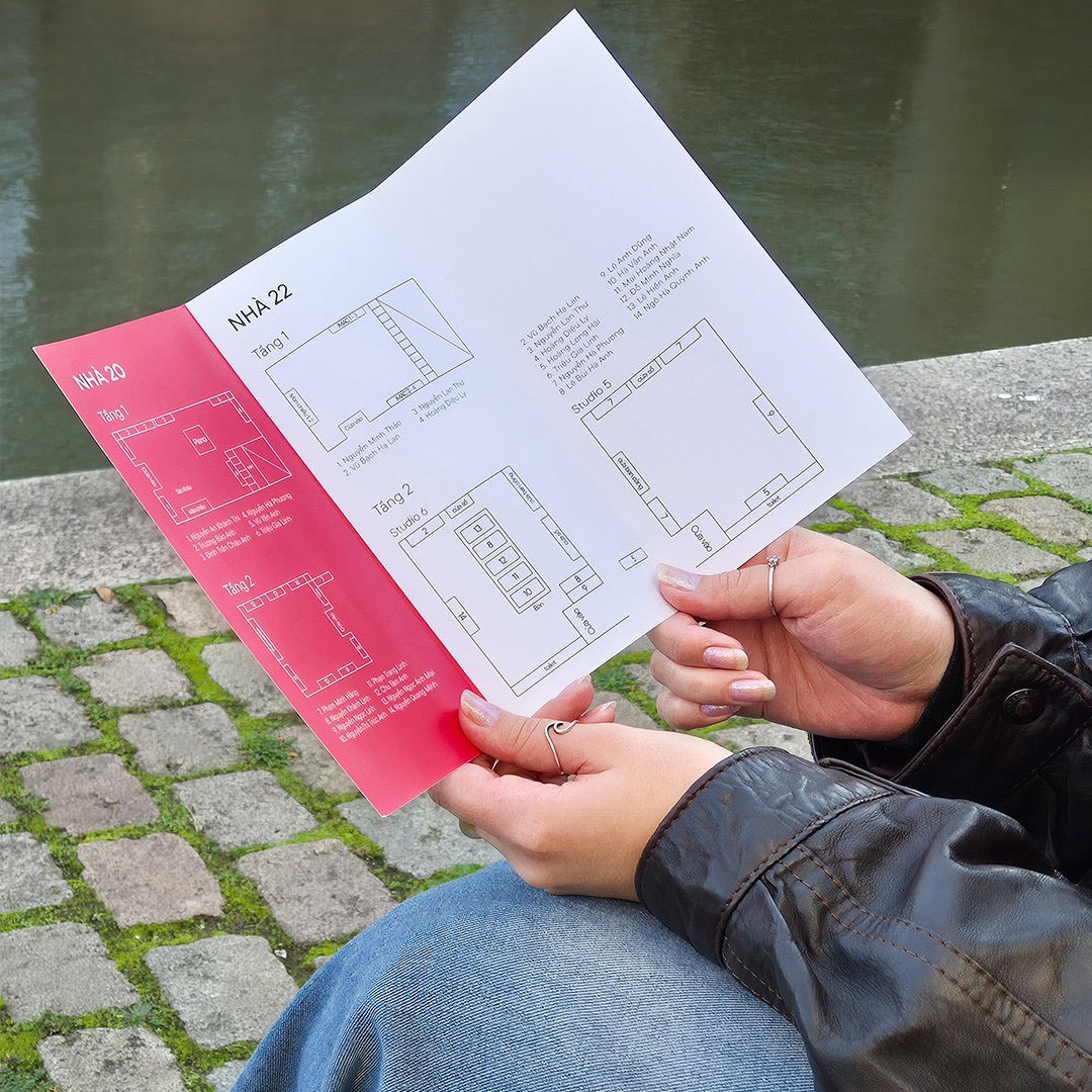
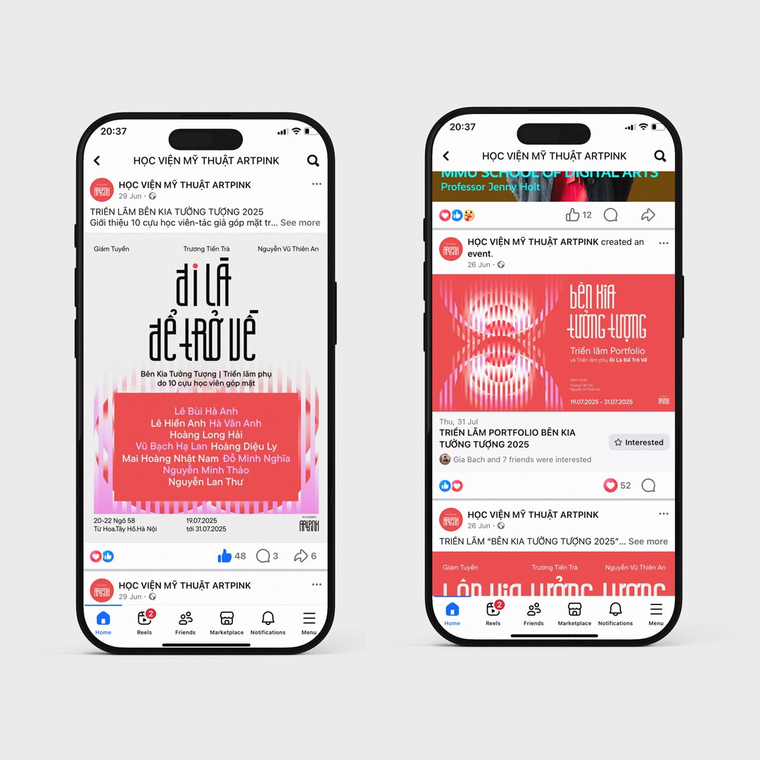
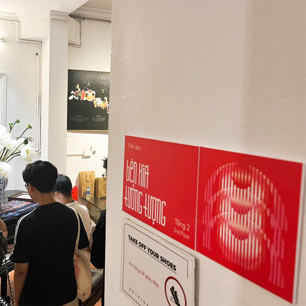
The design introduces a flexible, easy-to-apply pattern system. However, it still maintains a strong connection to the original identity through the continued use of Artpink’s iconic typeface and its signature red-and-white color palette.
Other side of imagination
2025/Brand identity
Client
Artpink AcademyRole
Graphic Designer
CHALLENGE
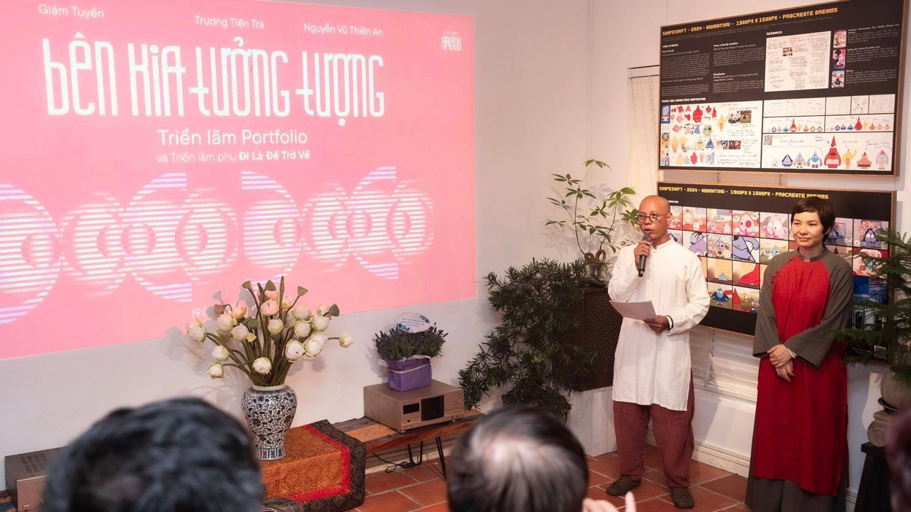
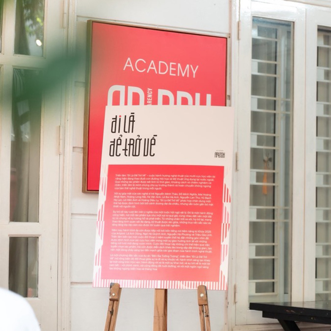
In 2025 the art academy Artpink presented two exhibitions called “Other side of imagination “ and “To go is to return”, showcasing works from current students and alumni. After 6 years of operation, their students’ artworks have evolved from traditional art forms to experimental and contemporary design, which required a fresh visual exhibition identity that can capture the academy legacy of elite art education while bringing young, forward-looking energy.
DESIGN SOLUTION
To convey the core messages of the exhibition, the design uses geometric circles motif to symbolize the circulation of clouds and water, where evaporation and rainfall represent the continuous cycle of learning abroad and returning home to contribute.
The design introduces a flexible, easy-to-apply pattern system. However, it still maintains a strong connection to the original identity through the continued use of Artpink’s iconic typeface and its signature red-and-white color palette.
Other side of imagination
2025/Brand identity
Client
Artpink AcademyRole
Graphic Designer
CHALLENGE
In 2025 the art academy Artpink presented two exhibitions called “Other side of imagination “ and “To go is to return”, showcasing works from current students and alumni. After 6 years of operation, their students’ artworks have evolved from traditional art forms to experimental and contemporary design, which required a fresh visual exhibition identity that can capture the academy legacy of elite art education while bringing young, forward-looking energy.
DESIGN SOLUTION
To convey the core messages of the exhibition, the design uses geometric circles motif to symbolize the circulation of clouds and water, where evaporation and rainfall represent the continuous cycle of learning abroad and returning home to contribute.
The design introduces a flexible, easy-to-apply pattern system. However, it still maintains a strong connection to the original identity through the continued use of Artpink’s iconic typeface and its signature red-and-white color palette.